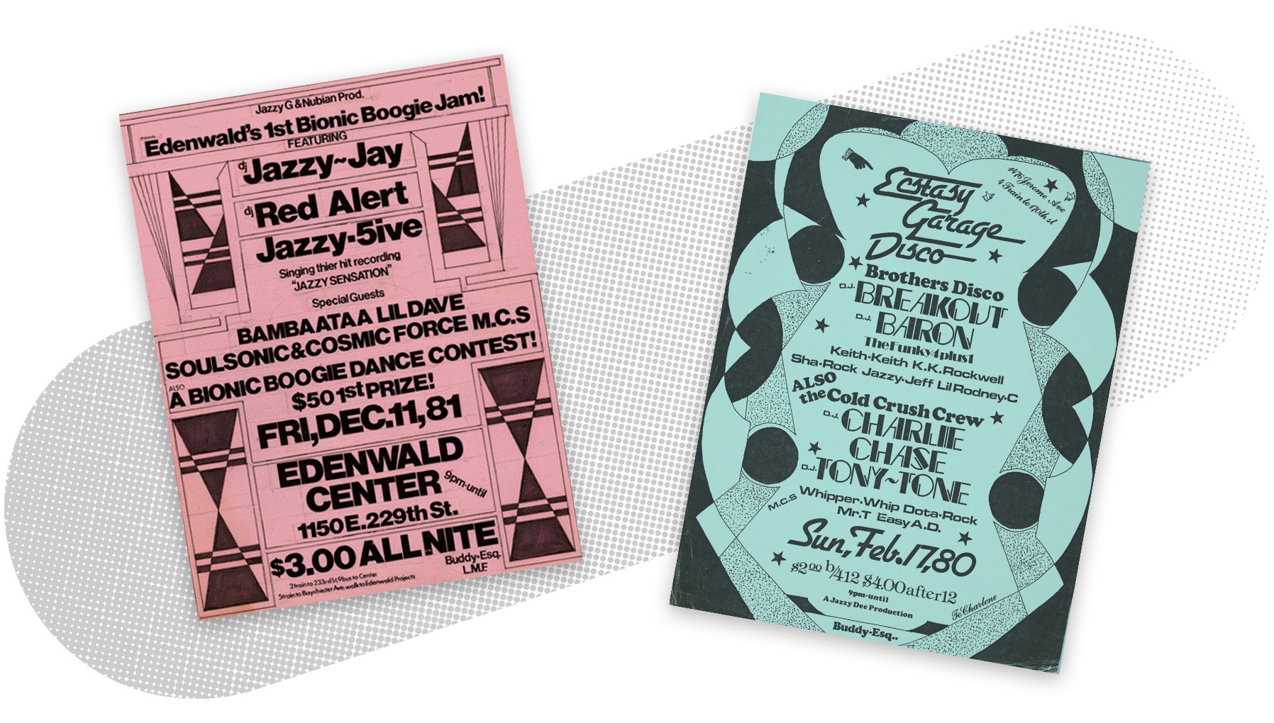
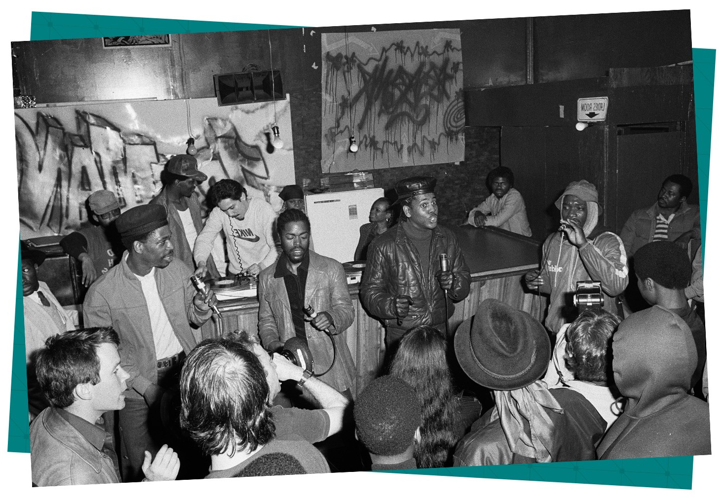
1. The Era or Cultural Moment Where the Design Emerged
In the late 1970s and early 1980s, the Bronx was experiencing economic hardship, disinvestment, and rapid cultural change. Yet in the middle of that struggle, a new creative movement was forming. Hip-hop was emerging through music, dance, graffiti, and live events hosted in parks, rec centers, and neighborhood clubs.
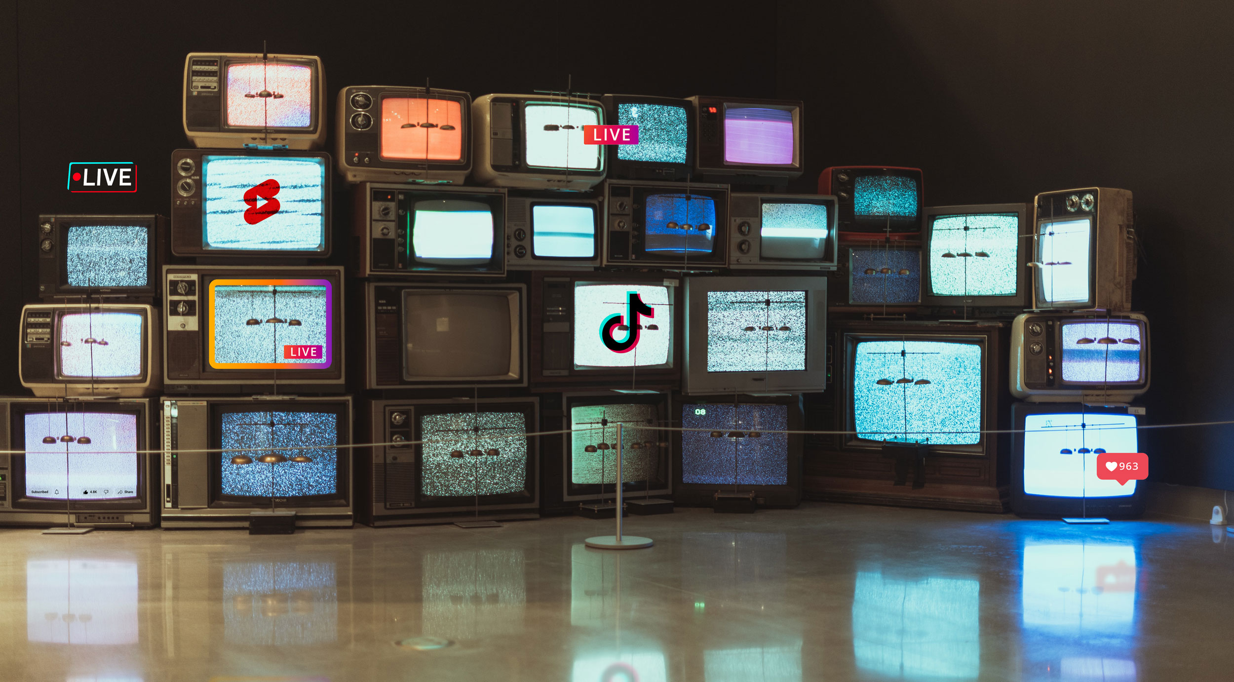
There was no Internet, no social media, and no digital advertising.
If you wanted people to know about your event, you had to spread the word physically—and quickly.
2. The Problem Being Solved, Not Just the Final Look
These flyers were not created to be beautiful. They were created to get attention. Promoters, DJs, and organizers needed a way to communicate:
- Where the party was happening,
- When it was taking place,
- Who was performing, and
- Why should someone care?
And they needed to do it in a matter of seconds. Pinned to walls, taped to poles, or posted in storefront windows, these flyers had to compete with visual noise and communicate instantly to people passing by on foot.
Their purpose was simple: Get someone interested enough to show up. That urgency shaped every design decision.
3. The Constraints That Shaped the Outcome
Much of what made these flyers visually distinctive came from the limitations of the time. Designers were working with:
- Reliance on Xerox and black-and-white photocopying, which rewarded bold contrast and highly legible compositions.
- Limited budgets, often producing materials as cheaply as possible
- Manual tools like scissors, glue, markers, and typewriters
- Tight timelines, with events needing promotion quickly
- Physical distribution, meaning every flyer had to be legible from a distance and in motion

These were not polished, corporate marketing campaigns. They were handmade, fast, and practical. And in many ways, the imperfections became part of the charm. The rough edges, uneven lettering, and hand-drawn illustrations gave these flyers personality that modern software often struggles to replicate.
4. The Design Language They Borrowed from Other Eras
Like many influential design movements, Bronx flyers did not emerge from nowhere. They borrowed heavily from surrounding visual culture and remixed it into something new.
Their influences included:
- Comic books, with bold type, exaggerated scale, and energetic layouts
- Graffiti lettering, bringing attitude, movement, and rebellious personality
- Newspaper advertisements, which packed dense information into structured layouts
- Disco and nightclub posters, which used dramatic typography and layered composition
But perhaps, the most unexpected design influence on these fliers was Art Deco theater architecture and marquee signage. Inspired by the grand movie palaces and historic venues of New York City, adding glamour, symmetry, and a sense of spectacle. A party in a school gym or community center no longer felt ordinary. It felt like a new cultural moment.

The result was a design language that felt both gritty and aspirational. When I look at the Art Deco lettering of the “Bronx Boys Club” in the flier above, I can see that it was inspired by the neon letters of Radio City Music Hall. I can imagine how difficult and time-consuming it was to draw these letters with a pen, pencil, or marker. From the comfort of the future (40 years later) I can see the imperfection between each letter, in the spacing between. These things were soon PERFECTED by graphic design programs and personal computers. For the decades since, perfection has been the norm. It’s easy. It’s everywhere. An imperfect letter, in contrast, somehow shines so much brighter.
5. The Transferable Principles You Can Apply Today
Though the tools have changed, many of the principles behind these flyers remain timeless.
Resourcefulness Fuels Creativity
Great work often comes from using limited tools in smarter, more inventive ways.
Human Imperfection Creates Warmth
Handmade, imperfect design often feels more authentic and emotionally compelling than polished perfection.
Hierarchy Drives Communication
Whether on a street flyer or digital ad, the most important message must stand out first.